Showing posts with label Magazine Advert. Show all posts

Thursday, 8 December 2011

Evaluation Activity 4

How did you use new media technologies in the construction and research, planning and evaluation stages?

I constructed this image to show the logos of the websites and programs that I have used over the course of this project. The size of each icon relates to how much we used it and how largely it influenced our project.


We used Prezi to create a couple of presentations during this project, including the presentation for our initial music video pitch. This website was useful for creating suave and interactive presentations, and offers something different compared to normal presentation programs.

Google was a useful website during the research stages of our project as it allowed us to search for other websites such as the Atlantic Records website and the Skepta website which I analysed.

Photoshop was of course a key program for us as we used it to add all the text and effects on the images for our digipak and the image for our magazine advert.

Blogger was obviously a key website for us, as this is where our progress was tracked and all our tasks can be found at different stages of completion. Without Blogger it would be impossible to track our progress and there would be no forum to post our work.

Twitter is a website which also came in handy as I used it to post the final cut of my video to my 376 followers and request feedback via Youtube comments. This was a useful method to reach a large audience as many of my followers are active web users and are likely to have Youtube accounts to comment, and many of my followers are also active users of Twitter especially in the evening, around 8pm-12am, the time bracket which I posted in.

Speaking of Youtube, this website was also vital as we used it to upload rough cuts of our video and other key videos such as our director's commentaries. Youtube is known to be the best online streaming website which is why we chose to use it, and the comments section allowed us to recieve easy and direct feedback.

Finally, the key program we used throughout this project was Final Cut Express. This program is great for editing videos and we used it to create our rough cuts, our final cuts, our director's commentaries, and our audience feedback videos (seen in evaluation task 3). All the effects visible in our final cut such as the earthquake effect and defocus effect, were added to clips via Final Cut Express.

As well as these websites and programs, we also used a variety of technological equipment during this project.


The mac above was the source of the editing programs we used; Photoshop for our pictures, and Final Cut Express for our videos, including our actual final piece. It was a privelege to have such efficient software and equipment provided by our college.


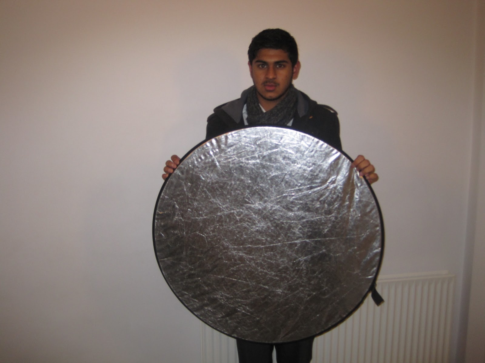
We used a light reflector for some of our shots in order to improve the lighting and direct it in a specific way. The main scene we used this in was the scene of Josh rapping in his bedroom, as we directed the shine from the ceiling light onto his face and body.


The tripod was vital as it allowed us to get steady, professional looking shots, especially in the music booth, which is where we used it most, with handheld shots being appropriate for much of the rest of our video.


The dolly was not used much in our video, however it proved useful for the shot of Josh taking out his iPod in his house as he walked towards the camera, as we rolled it back steadily on the tripod which of course was attached to the dolly. Using the dolly and tripod together meant that our shot could remain steady but also enabled camera movement.


Finally, the most important piece of equipment was the camera. We used a Canon HD video camera in order to record all of our shots, which we then uploaded to the Mac via a cable, before importing into Final Cut Express of course. This piece of equipment was irreplacable and expensive, and we were grateful to have it provided by our college. The camera was good because it was light and comfortable to hold, meaning it was easy to manouvere during handheld shots, and also the detachable piece of plastic seen on the bottom allowed the camera to be attached to a tripod when necessary. We also took pictures for our digipak on this camera, using the photo function. This gave the pictures a great HD look, and were great quality compared to what most digital cameras are capable of.

Evaluation Activity 3

What have you learned from your audience feedback?

Before deciding how to mould and promote our artist, we started our project with a questionnaire which we distributed to our target audience. This is the questionnaire.


1. Select your gender
Male     Female

2. Select your age
13-15     16-18     19-21     22+

3. Name your favourite 3 artists/bands? 

4. Which artist would you be MOST LIKELY to listen to based on genre and style?
Arctic Monkeys     Rihanna     Foo Fighters     Olly Murs     JLS     50 Cent     None

5. How would you define your favourite music genre?

6. Is there a particular sub-genre which you like more than other elements of the above genre?

7. What appeals to you about this genre/sub-genre?
Lyrics     Beats/Instruments     Fashion     Culture     It's popular

8. Which music channels do you watch regularly?
I don't have/watch music channels     MTV Hits     MTV Base     MTV Rock     MTV Dance          MTV Classics    

9. How do you consume music?
Free downloads     Purchasing physical CDs     Getting free CDs from festivals                            Online Purchase and Download (iTunes etc)

10. How much would you estimate that you spend on music in an average year?
Nothing     Less than £15     £16-30     £31-45     £46-70     £71-£100     £100-150     £151-300     £301-500     £500-1000     Over £1000

This video explains how feedback from our questionnaire allowed us to make inferences about the promotion methods which would be most effective, and how we could portray our artist to appeal to our target audience.


Feedback On Initial Idea
The general consensus from our media studies classmates and our teacher were that our song choice was excellent. This is because the song was appropriate (no excessive expletives) and was fitting as the song is called 'I'm 17' and all of us were 17 at the time. People also felt that the upbeat tempo of the song would work well and suit us as a group, especially as in our preliminary task, Manan and I came up with some fun ideas for our 'CD Is Dead' video which was also very upbeat. This showed our creativity and ability to perform in a video of this nature. Another reason that people liked our choice is because the song was a hybrid genre (rap/indie) which meant the video could also be a hybrid and possibly incorporate ideas and conventions of both these genres. Our initial ideas included many shots of Josh rapping to the camera on the streets and in the music booth, something which people agreed would fit well with the genre, feel and content of the song.

Concerns were raised however about a lack of depth and creativity in our video, as apart from Josh rapping to the camera in numerous locations, we had no other major shot ideas, with the exception of a shot or two of Josh trying to use a fake I.D to enter a club (an idea which we later abandoned after failing to achieve permission to film at the desired location). People also felt that our narrative would be weak if it just consisted of a visual interpretation of the lyrics (drinking, walking, going into college).

Based on the above feedback we decided to keep the ideas for Josh rapping to the camera on the streets and in the music booth, but decided that rather than making the college shots and the drinking shots part of a narrative, to just add them in as extra shots or performance shots. We also agreed that we would have to use a variety of editing techniques and camera skills in order to keep the footage exciting, as a 3 minute video mainly consisting of a performer rapping in different locations is likely to get boring unless editing is fast and efficient, and camera shots and effects are used carefully to enhance the impact of some scenes.

Rough Cut Feedback
This is the feedback we got from our peers and teachers based on our first almost complete rough cut, as quoted from an earlier feedback post on my blog.


The Good

  • People liked the extreme close-up of Josh's eyes at 0:05 as it looked professional.
  • The high-angle shot at 0:18-0:20 followed by the low-angle shot from 0:20-0:23 praised as it showed a variety of shots.
  • The very quick longshot of Josh at 0:24 was also singled out as it was cut to the beat nicely.
  • Josh was also praised for his performance in this cut. We anticipated that there was a lack of enthusiasm or creativity in the performance in our first cut so we were glad that this improvement was picked up on in the second cut, for example with Josh's dancing at 0:54
  • The shot of Josh in the music booth at 1:03 and 1:14 also went down well as people liked the way the camera was shaking and the performance was becoming more energetic as the song also became more intense at this stage.
  • Josh drinking at 1:09 produced a few laughs, as intended.
  • We were also told that the longshot of the dogs at 1:31 went well with the beat.
  • The very short shot of Josh jumping a fence at 1:38 was also singled out as a good shot.
The Not So Good
  • Concerns were raised about the lip syncing during the close-up of Josh at 0:36 to 0:38.
  • The shot from 2:07 to 2:14 was criticised for being possibly too long, and would look better with another quick shot in the middle at around 2:10.
  • People said that as the outro plays from around 2:50 to 3:10 people wouldn't mind seeing Josh dancing again.
  • Obviously concerns were also raised about the general missing spaces in footage but we fully intend to fill all the gaps! 
After recording the rest of our footage and inserting it into the timeline, our group then split up, allowing Josh and Manan to go on and produce their own edit, while I also produced a seperate edit by myself, using the feedback on what we had so far.

This is the first rough cut which I produced, complete with a director's commentary containing information on how we used our feedback and why we chose to use certain shots, effects and editing techniques. I have attempted here to amend the aforementioned criticisms on our first group cut.


Despite adjusting the audio, the absence of a microphone during recording means that some of the director's commentary is hard to hear, so here is a written version of the main feedback points, as quoted from an earlier post on my blog.

  • People liked the shots of the dogs. To be honest I'm not sure where they went, I do not remember taking them out, but I will gladly invite them back in for my final cut.
  • There was a close up, low angle shot of Josh lip syncing for the lyrics at 2:35 which was left out of this cut, but apparently it was good and should be used in the final cut.
  • The blur effect at 1:09 did not go down as well as expected. It was supposed to portray that Josh was tipsy from the alcohol but it ended up looking like a poorly focused shot in actual fact.
  • Josh appears to poorly lip sync during the booth shots at 2:39 and 2:42 and at the start of the 2:47 shot, so I plan to cut out the first two, and only keep the end of the 2:47 shot.
    Final Cut Feedback
    Based on this feedback I continued the editing process and completed a final cut which corrected any flaws which had been picked up on by viewers of our previous cuts. In this director's commentary we again explain why we chose to use some shots, how they are effective and how this cut is different from the rough cut.


    To gather feedback on my final cut I posted the link via Twitter, as I felt I could exploit my large following on there to reach a wide audience. The tweet that I sent out to my followers can be seen below.


    I gave an hour for people to leave comments before screen grabbing the feedback I recieved via youtube comments. As one can see, the overall consensus was that the video and performance was good and was especially fitting for our genre, but maybe the video lacked creativity in terms of location or concept. The feedback can be seen first hand in the 'View all comments' section here http://www.youtube.com/watch?v=cX1VC3-mPCk


    Digipak and Magazine Advert Feedback
    As can be seen further back on my blog, while we were creating our video we also created a digipak and a magazine advert for our artist's debut album. These projects were consistently worked on and updated based on feedback from our class peers and teachers. In this video Josh and Manan respectively speak on how feedback changed the look of both our digipak and our magazine advert.

    Sunday, 4 December 2011

    Evaluation Activity 2

    How effective is the combination of your main product and ancillary texts?

    The diagram below explains how certain frames from our video can be linked to our digipak (the back panel specifically) and our magazine advert, and what purpose this link fulfills.


    Overall we believe that our digipak, magazine advert and music video provided an effective combination. We believe that the overall feel of the video was representative of what people can expect from our artist in terms of future singles and albums, and we feel that the digipak and magazine advert photos are a perfect representation of our artist in terms of his style (this style also being matched in the music video). We felt that it was important to focus our ancillary tasks and music video on our artist, which is why all of the tasks revolve around the framing of our artist as the centrepiece and main attraction. In our video we decided to focus more on performance rather than a concept or narrative, as this is the best way to promote our artist's style, his personality, and his nature. His personality was also promoted with the behind the scenes shots which we incorporated into our final video, as seen at the bottom right of the diagram above. Similarly, we decided not to use any extravagant locations or props in our ancillary tasks, as we want the artist, his face and his style to be clearly promoted, so that he becomes recognisable and so that his audience can get to know him. We felt that any props or fancy locations in our photos, or intriguing narrative or concepts in our video would lead to more focus on the individual track and album, while our actual aim for this debut album is to promote the artist as a person and as a rapper. Another benefit of this is that in future albums and singles, once our artist is established, more creative ideas could be used and be considered original. This would also lead to people recognising a development in our artist, and it would give an impression that Iceburg is one to always improve on his previous best, and come up with new ideas as his career progresses.

    Thursday, 1 December 2011

    Finished Magazine Advert


    Looking icy. The theme looks icy. Like Iceburg. And he wears a lot of blue. Keeping it icy. We changed the green font to white with an outline so that it is still readable but also looks professional. We also changed the Twitter logo to a more modern looking one rather than the ugly square one. Also, rather than writing the whole Facebook URL, we noticed that most artists just advertise the custom part of the URL, which in this case is '/iceburg', as the Facebook logo represents the 'www.facebook.com' part of the URL. Same with Twitter.

    Monday, 14 November 2011

    Updated Album Advert


    This is a newer version of our album advert. Based on feedback we have compressed the icons in the bottom left to a smaller space, we have changed the colour of 'Unorthodox' to a more unorthodox colour, and we have made the font of 'Iceburg' blue so that it stands out more and so that it fits the name of the artist (icy theme).

    Thursday, 10 November 2011

    Updated Album Advert


    We updated our advert by making the font look more professional. We also moved the title of the album lower down to clearly seperate it from the artist's name. We compressed the icons more as we saw this done in Wretch 32's album advert. We also assured that the 'December 12' was on one line to make it professional and clear. We also removed unnecessary words from this sentence to make the poster more bold, clear and simple. The artist name is transparent and it looked poor when we had the album name transparent too so we had to figure out how to change it and blend it as the same colour as the artist name at the top. We used www.1001freefonts.com to specifically find a good and professional font rather than the default and amateur looking ones we had before.

    Monday, 31 October 2011

    Similar Artist Album Advert In Magazine

    This is an advert in a magazine for a similar artist to ours (Wretch 32). The advert shows the artist to promote his image and also tells us his name and the name of the album, both quite large and clearly. The advert also promotes the album further by mentioning the star names who feature on the album alongside Wretch 32. The release date is also clearly written in bold. This is accompanied by logos of stores and websites where the album is available, which then lets the reader know where and when they can purchase the album if the name, image or associates of the artist have gained their original interest. The URL of the artists Myspace page also appears so that viewers can type it in and check whether they like the sound of his music before deciding to purchase the album or not.