This is my final edit for our video for Rizzle Kicks - I'm 17, a video I produced on Final Cut Express for the Apple Mac.
Changes made since my rough cut include the re-insertion of the dog clips, the removal of the blur effect at 1:09, and the correction and changing of the sequence between 2:35-2:48, as well as a few other minor changes. I hope you enjoy the video!
Showing posts with label Final. Show all posts
Showing posts with label Final. Show all posts
Friday, 2 December 2011
Thursday, 1 December 2011
Finished Inside Panels For Digipak
These are the finished inside panels for our digipak. These panels provide fans with extra photos of our artist to admire, something which more hardcore fans would appreciate, and would inspire them to buy the digipak. The middle panel is where the CD would be placed.
Finished Outside Panels For Digipak
These are the finished panels for the outside of our digipak. Information on the front and back cover can be seen in the posts below. For the other panel here we used an iconic shot to sum up the urban style of our artist. The other part we edited here was the spine between the front and back cover. The spine is important as when looking at a physical CD on a shelf, often only the spine is displayed, so it is important to get the key information of artist and album name down on the spine so that people can pick it out easily. We also put the record label logo on the spine as it seems a professional technique because we have seen other CD and digipak spines with this on them. Also, we put a 7 digit number at the end which we have also seen on other digipaks and CD's. We decided to use the same font all over for the website name on the back cover, the track listing, the font on the front cover, and the writing on the spine, as we believe it fits well and results in good consistency.
Finished Back Cover
This is the finished back cover for our digipak. We used a shot from the recording session of Josh in the music booth for our back cover as it looked like a nice 'real' shot as opposed to all the posing in the other pictures. We decided to use the black paper on the wall as a background for our track list as it looked random when nothing was written on it, so we made good use of it. This worked out well as there was nowhere else we could have written the tracklist without using a different shot for our back cover. In the bottom right is the barcode. We believe this placement and size is accurate based on other albums and digipaks we have looked at. We put in the Atlantic Records logo next to this as we noticed label's logos often appear on the back cover of albums and digipaks as well. The website remained at the bottom in a font which fits in with the other white text and logos. This is followed by a copyright symbol which again adds a professional touch. Finally, we have inserted the Dolby Digital logo as we noticed that this appeared on the back cover of many CDs as well.
We used the magic wand tool on photoshop to get rid of the white part of the copyright logo and the black writing in the Atlantic Records logo as we felt that it looked better with these parts transparent. We also did this for the Dolby Digital logo as when we got it from Google images it was black writing on a white background, so we got rid of the background before inverting the colour to white as this goes better with the other writing on the back cover.
Finished Front Cover
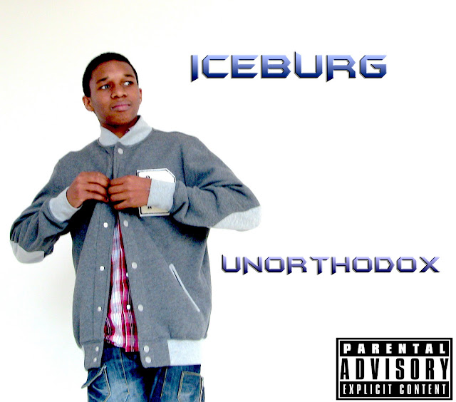
This is the finished version of the front cover of our digipak. The picture was taken against a plain white wall as we wanted it to look professional and wanted a clear, recognisable picture of our artist for his debut, so that he can become known by his image, and his face and style becomes recognisable to fans of his music and his genre. Since our last edit we have moved the parental advisory logo to the right as it overlapped with Josh's body when it was on the left, while the right was looking plain. The artist name is in a large font next to him, and is in a blue/purple colour as these are cold temperature colours, which of course ties in with the name 'Iceburg' nicely. The title of the album is lower down to clearly seperate it and is in a smaller version of the same font as the artist name is more important, the title of the album is only important to let people know what product they are looking at or purchasing. Overall we are very happy with this cover as it looks professional and portrays our artist clearly and makes him look urban so that his genre and style is made clear at first sight to anyone who may be interested in this genre.
Finished Magazine Advert
Looking icy. The theme looks icy. Like Iceburg. And he wears a lot of blue. Keeping it icy. We changed the green font to white with an outline so that it is still readable but also looks professional. We also changed the Twitter logo to a more modern looking one rather than the ugly square one. Also, rather than writing the whole Facebook URL, we noticed that most artists just advertise the custom part of the URL, which in this case is '/iceburg', as the Facebook logo represents the 'www.facebook.com' part of the URL. Same with Twitter.
Subscribe to:
Posts (Atom)


